
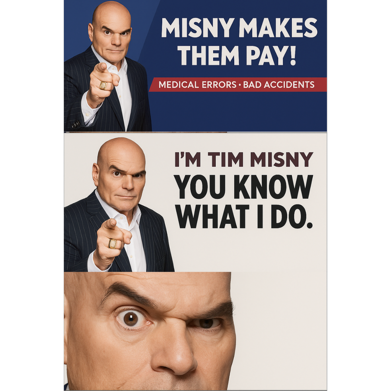
 While most brands are in a race to become minimalist Helvetica zombies, Tim Misny is out here squinting at drivers like a bald eagle who moonlights as a litigator.
You can’t scroll through LinkedIn without seeing yet another legacy brand swapping out a classic logo for a sanitized, sans-serif shrug. The logic? Clean, modern, universally appealing. The result? Indistinguishable. Misny’s approach is the antithesis. It's loud, personal, and defiantly un-minimal. He doesn’t hide behind a font. He is the font. He doesn’t dilute his message to appeal to everyone. He concentrates it into something so potent, it leaves an aftertaste. The move toward blanding, err sorry, I mean branding, is about safety. It’s about not offending, not standing out too much, not making a mistake. But in trying to avoid being wrong, most brands forget to be anything at all. Misny, on the other hand, is unforgettable. He dares to be specific. Weird, even. And here’s the irony: while most companies are spending millions crafting universal “brand experiences,” Misny is just being himself. No gradients. No lowercase rebrands. Just menace in a pinstripe suit. In a world where everyone’s trying to be palatable, the man who dares to be distinct wins the billboard war.
0 Comments
|
Categories |
 RSS Feed